Wednesday, 2 April 2014

Draft 3 & 4 (Film Poster)

Draft #3

Here is the 3rd draft for my film magazine. 


Below is a side by side comparison of drafts 2 and 3 and the only change was the photo. I thought changing it and using a different image would be a good idea because to me, there was something that didn't feel right. I think she lacked character and by comparing the images, it is clear that they are both opposite (in terms of emotion) to each other. In draft 2 (left) my model (Sarah playing as Julie) she seems quite calm and relaxed (which is the type of person Julie is in the film trailer) but the only thing is, it's boring and lacks emotion. Draft 2 (right) on the other hand we can see Sarah displaying a version of Julie that is not revealed in the film trailer. Looks fierce, fearless, ready for action.


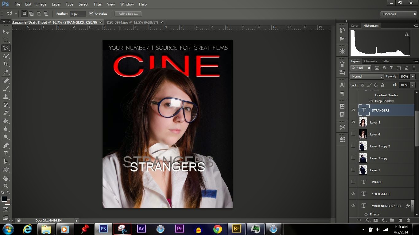
Now that I was satisfied with the overall look of the magazine I thought I'd use the guideline tool in photoshop to help keep things consistent and tidy as I was applying the finishing touches on my way to a 4th and perhaps, final draft.


Closer view of guidelines as seen from Adobe Photoshop CS6, Desktop view.


Draft #4

Changes made: 
*Changed content of Header as well as font.
*Added the Issue date and cost/price of magazine.
*Added a plug to the bottom right corner of magazine to balance the blue title of the masthead.


Drafts 1 & 2 (Film Poster)

Draft 1
Below is the 1st draft of my film poster. This time I've added in some coverlines and other conventions to get a much better understand of how the final product will look like. 


Various stages of the drafts loaded in photoshop as seen from my desktop. 


Draft 2

Below is the 2nd draft for my film magazine cover. As you can see I have added some more coverlines as well as the barcode. Not much have changed but it took me nearly 2 hours to get the bottom portion of the magazine correctly because it was proven to be quite difficult, trying to figure out which colour scheme would work best against the actress' hair. I tried plain blue text but it wasn't correct as it was difficult to see the title of the film, I even tried black but that didn't work too well either. To rectify the issue, I left the title of the film as it is, plain white & added in a shadow effect behind the text so it stands out prominently.


Concepts & Ideas (Film Magazine)

 Below are two different concepts for the final look of my film magazine. I'm debating on which one to take a step further as they both look really good. However, I think I'm more biased towards the blue masthead concept, mainly because it's a lot less subtle than the red. Moreover, it matches the blue label as well as the goggles of my model. 

Concept 1


Concept 2


As it stands, I think I'll keep the blue Masthead because I personally agree with it and thinks it's more suitable for the picture. I will however continue to experiment with other photographs, trying various framing to see how the text fits around the cover. 

Tuesday, 1 April 2014

Film Magazine Cover (Ancillary Text 2) Photoshoot

Below is an array of Photographs (as shown in Adobe Bridge) from my most recent shoot for my Film Magazine. Included are examples of test shots, unedited versions and edited versions which I consider to be worthy of being featured as the final shot for the front cover.


Test Shots & Set-up

Here I have a few examples of the very first shots that were taken. These are indeed the test shots and there is a gradual progression in terms of exposure as I was trying to find which camera & lighting settings were best. The procedure took approximately 1-2 minutes to complete.


The black backdrop used to contrast the white labcoat of the actress/model. 

An example of an underexposed shot taken while I was adjusting the correct exposure & lighting for the mise-en-scene.
 An example of an overexposed photograph. Got a little too carried away with the settings and got more than what I needed. 

Test shot of when I got the settings just right.

The Shoot (Examples of Edits)

Below are some examples of before and after shots. In the 'after' shots you'll notice the images to be slightly better. I've done this by increasing the saturation and adjusting the white balance & contrast to achieve a more vibrant and rich feel. Though the changes may be subtle, they make a big difference.

Before                                                     
 After

Before


                 After

Before
                                                                              After


Image in the process of being edited on Adobe's Camera Raw


Final Edits

Below are examples of final edits, some of which I consider to be front cover worthy.


Thinker 

Investigative & Observant


Suspicion


Julie, played by Sarah Vause (who is one of the starring characters in my film 'Strangers') is known for her laid-back attitude,  generosity, integrity and effectively quick ability to reason. Above & Below is a variety of different emotions & attitudes portrayed through visual imagery by Julie.

 Happy & Friendly  
 

Stern (Serious, Strict)


Remorseless (Calm, Laid-back)

Conclusion (Evaluation of Photoshoot)

Overall, I felt like this shoot was worth it and I enjoyed working with my friend Sarah. Her submissive attitude & willingness made life easy for me because sometimes it can be difficult working with people. I found that the best way to get the best out of your model is when both the photographer & model are both comfortable with each other. Because Sarah was in an environment where she wasn't faced with any Prejudice, it enabled her to be herself, displaying a vast array of emotion & attitude. Moreover, we were the only ones in the studio because it was after hours and nearly all the students from college had already gone home by then. 

Below: Selfie of me and Sarah after the shoot


First assessment of Film Trailer (Becky)


Film Trailer (Draft 2)

Assessment Sheet (Feedback from Teacher)


Above are both the front & back pages of my project assessment sheet. The feedback I received from my teacher was generally positive and I will endeavor to make the changes required.

Proposed Audience Feedback Questionnaire

I've generated a questionnaire for my final audience feedback. Since I am the creator of the product I need to find out what my audience thinks about my product to determine wether or not we're on the same page. I don't expect anyone that I interview to all respond exactly the same way because people interpret differently as they have different ideologies, norms and beliefs. One person might think that my product is complete absurdity and another may think it's educational & might find it beneficial to them.

Final Version of Film Poster (Ancillary Text 1)

 
Above I have the final version of my film poster, after careful consideration and close examination of actual film posters I made a few dramatically subtle changes. Below is a copy of the previous version and you can immediately tell that they are very different, but not that much. Changes: 1. I've used an actual shot from my film trailer to make the poster as authentic as possilbe. 2. I moved the credits further down the bottom of the page and made the text very fine as seen on most existing film posters. 3. I've included the actual release date this time and enhanced the photos of the characters.