Friday, 21 February 2014
FULL Draft #1 (Film Trailer)
Monday, 17 February 2014
Strangers (Film Poster)
Final Draft of my Film Poster. This is the unofficial version of it as the poster can be subject to change.

Ancillary Text 1 -Film Poster (Production)
Handmockup of Film Poster

A handrendered mockup (concept) of the desired look of my film poster.
Step 1 (The Canvas)
Having already done research for my ancillary texts I was now ready to go about producing them, starting with my film poster. I've found that the standard, international & common size for film posters (as they come in various forms) is 27 inches wide by 40 inches tall.

With the use of Photoshop I created a blank canvas with those exact dimensions with a resolution of at least 300 dpi (dots per inch) for optimum quality. Since the film poster will not be printed I left my color mode set to RGB as it will only be rendered digitally.
This stage is no doubt the most difficult part in creating any product. Using examples of film posters and my conventions analysis as a guideline it wasn't long before ideas started storming into my head.
Step 2: Image & Text (Preparation)
Conventionally, films always use photographs of scenes/shots from the actual films so I thought to follow protocol I would do the same by using shots from my film trailer. Of course, official films have much higher quality shots, for me this wasn't the case. I had to use photoshop to adjust the levels and colour correct the images of my characters to match those of existing film posters.

I went back to have a look at existing Sci-Fi film posters to see what type of fonts are used on them. In my findings I notice that designers use spaced-out normal, thin to very thin sized text formats on their posters.


I then looked at fonts that I could possibly use for my Film Poster from www.dafont.com and came across one called 'Florencesans' which seemed very suitable for the title of my film.

Step 3: Image & Text (Placement)
The poster in its primitive stages as you can see below. I've placed the edited images of my characters (extracted from live footage from my film trailer) onto the blank canvas along with the text. Conventionally, images of the main actors are placed at the very top with the title of the film near dead centre and the credits to the very bottom.
Since Sci-Fi film posters and most movie posters are generally dark in colour I painted my canvas black using the paint bucket tool and changed the text to white. From then I also entered the names of the main characters.

Since it is impossible for me to create real aliens I had to use secondary images as an option to include them on my film poster. By using a combination of different images I created my own background using layer blending and the brush tool to create a new, original image.

Secondary Images (Layer blending)

Step 4: Making the credits
This procedure was no doubt the most challenging step of the creation process because its hard to create credits from scratch. I had to keep referencing existing film posters, luckily for me, during research I came across a website where I was able to download text and a template for the credits.

I then loaded the template into photoshop alongside my film poster and used it as a guide to create my credits.
.JPG)
I kept the template close by on the canvas while I made mine using the type tool on photoshop.

After making my own credits, I inserted my production comany logo along with the executive producer (wyke college media) logo.

So far we can see that everything is coming together. The foundation was laid so now I was able to fine tune my product and add extra detail.

Step 5: Finalization & Fine Adjustments
I wanted to give the poster some beauty, as well as final touches so it will seem as realistic as possible. On the bottom right you'll notice a poster from 2013 Sci-Fi film 'Stranded,' I used it as my main guideline and reference point throughout the design of my poster.


Sci-Fi film posters (especially alien/space related ones) often have stars or some form of celestial object on them so I thought I would add some stars on mine. I did this by using going through different brush palettes on Photoshop and selecting one that's reflects a star.

Close up of patterns


I then thought what could I do to enhance the appearance of the title of the film and created a shadow by duplicating the layer and then blurring the bottom layer using the blur tool (creating a ghost like effect). Then I scaled up the background text layer and faded it slightly with the eraser tool to keep it subtle.

Lastly, I further enhanced the title by beveling and embossing the text to make it look three dimensional, which is what a lot of existing film posters do to make their text stand out.

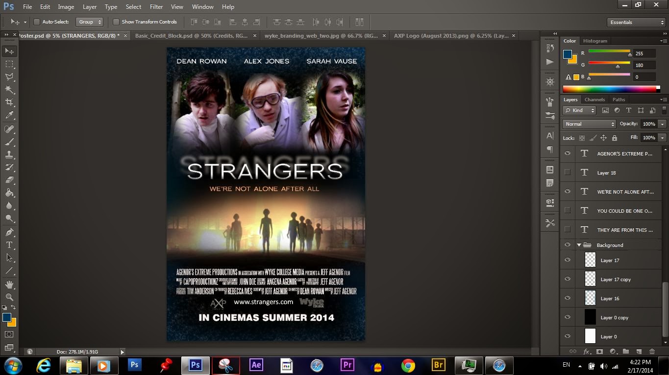
The final product loaded in photoshop with layers of all files which can be seen to the right of the screen.
Subscribe to:
Posts (Atom)